by Winston-Patrick Wee
Young Adventurers’ Club. That was the original name of our Club when the idea of setting an adventure club was mooted by four young adventurers – Paul Fong, William Chin, Eddy Toh and Peter Teo – back in 1962. It was later changed to the Singapore Adventurers’ Club prior to the formal registration with the Registrar of Societies and one possible reason for the change, I reckon, was the foursome must have realised that they would have otherwise unwittingly signed an early death warrant to their own membership had the name change not come about.

Our first logo – a young man and woman trekking side-by-side with backpacks on their backs and proudly carrying a flag with the name “Singapore Adventurers’ Club” and the motto ‘Achieve for Success” – was designed by one of our early members Danny Tan in 1964. The logo was typical of designs in the early post-colonial era when self-governing Singapore had just traded the Union Jack for the flag of newly independent Malaysia as Singapore was then a part of the bigger scheme of things.
A functional design with the typical 60s look, the young man and woman served as epitome that adventure was not just a man’s thing but a woman’s thing as well. It was a reminder to everyone that nature was (and is) not chauvinistic when it came to adventure. ‘Achieve for Success” was a call that was relevant 40 years ago as it is still relevant today. Judging by the number of milestones that we have crossed, SAC has indeed achieved many successes.

SAC’s second logo (1977-1997)
Designer : Simon Lee
As the Club turned 14th in 1977, it decided that it should shed its 60s image and a design was selected from amongst the numerous entries in its first logo design contest. Simon Lee’s design was a total departure from the stifled 60s – the new and simplistic design but yet abstract – was an adolescent rebellion against the establish ment of the 60s. A spiral curve winding towards its axis was actually a graphic representation of the long and winding road up to the top of a mountain. Green became the Club’s new colour – an apt colour for Mother Nature no doubt, and a colour of youth and vitality. The twenty one years, up to 1998, that followed were indeed a long and hard trek up a winding road up to the top of a high mountain. We sweated, we pained but we never let loose that vision to reach the top. We finally did it and from here, SAC is ready for an even higher mountain peak.
Twenty-one years that passed had trans-formed the rebellious teenager into a matured adult. It is still young – as compared with some local centenarian clubs – and it still has that characteristic vigour, but with age comes wisdom and respect. Symbolism of the 70s must give way to form and form must have dignity and pride to gain public recognition and admiration. SAC was 35 years old in 1998 – still young but wise and respected and so its logo likewise should reflect that phase of time. Hence, a second logo contest was organized in late 1997 to mark our coming of age.

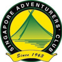
Unveiled during our 1998 AGM, Benny Ong’s design was chosen from amongst quality entries that we received. Benny’s design is circular with spread of green, yellow and black to give that touch of class and professionalism. The black banner with our Club’s name in bold proudly embraces the circumference and the year of our birth 1963 bears testimony of our long history (in comparison with other local adventure clubs). The green mountain in the foreground is also a camper’s tent, sitting peacefully against the setting sun, evident by the rich yellow in the background, with its shadow reflected in the lake. To use Benny’s own words – the centre pictogram plays on one’s perception as it calls to mind a dual image of a serene mountain by a lake as well as a camper’s tent. The year 1963 at the bottom shows the year that the Club was established and this also bears testimony of the long and proud history of the Club. Overall, the earth tones and clean lines of the logo presents a professional image of the Singapore Adventurers’ Club.
With 3 logos and 40 years of experiences, SAC has indeed come a long way as an adventure club. “Achieve for Success” should not be seen as a motto of the 60s to be archived and forgotten, it is still a call that is echoing strongly in the minds of many SACians.

